San Francisco Sea Level Experiment
 San Francisco sea-level
import matplotlib.pyplot as plt
plt.rcParams.update({'font.size': 12, 'font.weight': 'regular'})
import pandas as pd
import numpy as np
import geopandas as gpd
import matplotlib.pyplot as plt
import statsmodels.api as sm
from matplotlib import cm
from scipy.stats import stats
from sklearn.metrics import mean_squared_error
from math import sqrt
import elevation
import rasterio
from osgeo import gdal
import sys
Questions:
- Is the rate of sea level rise increased in San Francisco?
Processes:
- Get data
- Visualize sea level rise data
- Bootstrap slope for sea level rise
- Plotting different bootstrapped slopes and confidence intervals
- Plotting effected area based on predicted slopes
Concern:
- What temporal scale to analyse? Annual
- What location to analyze? San Fransico
Assumptions:
- Model simplication: using only sea level as the factor for flooding probability, holding all other factors such as subsidence level, soil conditions, precipitation and elevation constant.
Data about Sea Level from NOAA
Here is the prediction of sea level till 2100 from the NOAA taken from the report Global and Regional Sea Level Rise Scenarios for the United States

Here is the relative sea level trend mesure by the SF NOAA station. The data yields monthly mean sea level, a linear relative trend, an upper and lower 95% confidence intervals from 1850 to 2025.
The mean sea level is shown without the regular seasonal fluctuations due to coastal ocean temperature, winds, atmospheric pressures and ocean currents.
According to the summary table, monthly mean sea level data from 1897 to 2018, San Francisco is at relative mean sea level of 1.96 mm/year with a 95% confidence interval of +/- 0.18 mm/year
sf_sea = pd.read_csv("data/SF_annual_sealevel.csv", index_col=False)
sf_sea.columns = [col.replace(' ', '') for col in sf_sea.columns]
sf_sea.head()
| Year | Month | Monthly_MSL | Unverified | Linear_Trend | High_Conf. | Low_Conf. | |
|---|---|---|---|---|---|---|---|
| 0 | 1850 | 1 | NaN | NaN | -0.223 | -0.196 | -0.249 |
| 1 | 1850 | 2 | NaN | NaN | -0.222 | -0.196 | -0.249 |
| 2 | 1850 | 3 | NaN | NaN | -0.222 | -0.196 | -0.249 |
| 3 | 1850 | 4 | NaN | NaN | -0.222 | -0.196 | -0.248 |
| 4 | 1850 | 5 | NaN | NaN | -0.222 | -0.196 | -0.248 |
Let’s do a sanity check on these categories.
sf_sea.describe()
| Year | Month | Monthly_MSL | Unverified | Linear_Trend | High_Conf. | Low_Conf. | |
|---|---|---|---|---|---|---|---|
| count | 2112.000000 | 2112.00000 | 1982.000000 | 0.0 | 2112.000000 | 2112.000000 | 2112.000000 |
| mean | 1937.500000 | 6.50000 | -0.100253 | NaN | -0.098211 | -0.087174 | -0.109251 |
| std | 50.818036 | 3.45287 | 0.093805 | NaN | 0.078656 | 0.076908 | 0.080614 |
| min | 1850.000000 | 1.00000 | -0.359000 | NaN | -0.223000 | -0.196000 | -0.249000 |
| 25% | 1893.750000 | 3.75000 | -0.167000 | NaN | -0.165000 | -0.154000 | -0.176000 |
| 50% | 1937.500000 | 6.50000 | -0.109000 | NaN | -0.117000 | -0.106500 | -0.124000 |
| 75% | 1981.250000 | 9.25000 | -0.039000 | NaN | -0.031000 | -0.023000 | -0.038000 |
| max | 2025.000000 | 12.00000 | 0.290000 | NaN | 0.056000 | 0.069000 | 0.042000 |
Let’s see what the raw data show us.
plt.figure(figsize=(15,7))

plt.scatter(sf_sea['Year'], sf_sea['Monthly_MSL'],
           label = "Annual Mean Sea Level",
           color='lightblue')
plt.plot(sf_sea['Year'], sf_sea['High_Conf.'],
           label = "High Confidence", color='purple',
        linewidth=2)
plt.plot(sf_sea['Year'], sf_sea['Low_Conf.'],
           label = "Low Confidence", color='black',
        linewidth=2)
plt.plot(sf_sea['Year'], sf_sea['Linear_Trend'],
           label = "Linear Trend", color='red',
        linewidth=2)

plt.xlim(1850,2025)
plt.ylabel('Meters')
plt.xlabel('Year')
plt.title('Relative Sea Level trend - San Francisco, CA')
plt.legend()
plt.show()
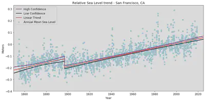
Notice the apparent datum shift in near 1900. To avoid this shift affecting our function, we will use data after 1900 to negate this anomaly in predicting the slopes later on. The plot shows the monthly mean sea level without the regular seasonal fluctuations due to coastal ocean temperatures, salinities, winds, atmospheric pressures, and ocean currents. The plot also shows long-term linear trend and its 95% confidence interval. The unit is in meters/year or millimeters/year and in feet/century (0.3 meters = 1 foot).
Use Locally Weighted Regression (LOWESS) to fit curve to Sea Level data
sealv_sf = sf_sea[sf_sea['Year'] > 1900]
sealv_sf.head()
| Year | Month | Monthly_MSL | Unverified | Linear_Trend | High_Conf. | Low_Conf. | |
|---|---|---|---|---|---|---|---|
| 612 | 1901 | 1 | -0.132 | NaN | -0.190 | -0.177 | -0.202 |
| 613 | 1901 | 2 | -0.122 | NaN | -0.189 | -0.177 | -0.201 |
| 614 | 1901 | 3 | -0.179 | NaN | -0.189 | -0.177 | -0.201 |
| 615 | 1901 | 4 | -0.251 | NaN | -0.189 | -0.177 | -0.201 |
| 616 | 1901 | 5 | -0.191 | NaN | -0.189 | -0.177 | -0.201 |
plt.figure(figsize=(15,7))
lowess = sm.nonparametric.lowess
lowess_80_month = lowess(sealv_sf['Monthly_MSL'],sealv_sf['Year'], frac=.80)

plt.figure(figsize=(15,7))
plt.scatter(sealv_sf['Year'], sealv_sf['Monthly_MSL'],
           label = "Raw data",
           color='lightblue')
plt.plot(sf_sea['Year'], sf_sea['Linear_Trend'],
           label = "Linear Trend", color='red')

plt.plot(lowess_80_month[:,0],lowess_80_month[:,1],label='LOWESS (frac=0.80)',
        color = 'purple')
plt.ylabel('Meters')
plt.xlabel('Year')
plt.title('Relative Sea Level trend - San San Francisco, CA')
plt.xlim(1900,2020)
plt.legend()
plt.show()
<Figure size 1080x504 with 0 Axes>
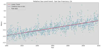
The lowess curve used a .80 fraction, that allows better estimation because we are taking smaller fraction of data points for each estimate value of the curve. The trend line calculated by the NOAA is close to the lowess curve line though it is higher than the lowess line slightly.
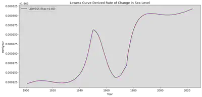
Lets look at the year to year rate of change using the lowess curve.
Calculate the rate of change from the LOWESS curve
Lets get the mean sea level for each year by creating a new table for aggregated data grouping by year from the original table. Also, it would be useful here to convert sea level from meters to millimeters for comparison to the estimated 1.96 mm/year figure from the NOAA.
years_mean_array = sf_sea.groupby('Year').Linear_Trend.mean()
annual_level = pd.DataFrame({'annual_m': years_mean_array}).reset_index().dropna()
annual_level= annual_level[annual_level['Year'] > 1900]
annual_level['sealevel_mm'] = annual_level.annual_m*1000
annual_level.tail(10)
| Year | annual_m | sealevel_mm | |
|---|---|---|---|
| 166 | 2016 | 0.037167 | 37.166667 |
| 167 | 2017 | 0.039000 | 39.000000 |
| 168 | 2018 | 0.041000 | 41.000000 |
| 169 | 2019 | 0.043000 | 43.000000 |
| 170 | 2020 | 0.045000 | 45.000000 |
| 171 | 2021 | 0.046917 | 46.916667 |
| 172 | 2022 | 0.048833 | 48.833333 |
| 173 | 2023 | 0.050833 | 50.833333 |
| 174 | 2024 | 0.052833 | 52.833333 |
| 175 | 2025 | 0.054833 | 54.833333 |
sf_sea.tail()
| Year | Month | Monthly_MSL | Unverified | Linear_Trend | High_Conf. | Low_Conf. | |
|---|---|---|---|---|---|---|---|
| 2107 | 2025 | 8 | NaN | NaN | 0.055 | 0.069 | 0.041 |
| 2108 | 2025 | 9 | NaN | NaN | 0.055 | 0.069 | 0.041 |
| 2109 | 2025 | 10 | NaN | NaN | 0.055 | 0.069 | 0.042 |
| 2110 | 2025 | 11 | NaN | NaN | 0.056 | 0.069 | 0.042 |
| 2111 | 2025 | 12 | NaN | NaN | 0.056 | 0.069 | 0.042 |
#using the lowess formula for annual sea level table aggregated above
lowess_80_annual = lowess(annual_level['annual_m'],annual_level['Year'], frac=.80)
sf_sea_lowess = pd.DataFrame({"Year": lowess_80_annual[:,0], 'lowess_sealevel': lowess_80_annual[:,1]})
sf_sea_lowess = sf_sea_lowess.dropna()
sf_sea_lowess['lowess_mm'] = sf_sea_lowess.lowess_sealevel*1000
sf_sea_lowess.head()
| Year | lowess_sealevel | lowess_mm | |
|---|---|---|---|
| 0 | 1901.0 | -0.188666 | -188.666175 |
| 1 | 1902.0 | -0.186703 | -186.703055 |
| 2 | 1903.0 | -0.184740 | -184.739933 |
| 3 | 1904.0 | -0.182777 | -182.776810 |
| 4 | 1905.0 | -0.180814 | -180.813687 |
lowess_changerate = []

for n in range(0,len(sf_sea_lowess)-1):
    sealevel_change = sf_sea_lowess['lowess_mm'][n+1]-sf_sea_lowess['lowess_mm'][n]
    year_change = sf_sea_lowess['Year'][n+1]-sf_sea_lowess['Year'][n]
    lowess_changerate.append(sealevel_change/year_change)
plt.figure(figsize=(15,7))
plt.plot(sf_sea_lowess['Year'][:-1],lowess_changerate,label='LOWESS (frac=0.80)',
        linewidth = 2, color = 'purple')
plt.ylabel('mm/year')
plt.xlabel('Year')
plt.title("Lowess Curve Derived Rate of Change in Sea Level")
plt.legend()
plt.show()
frac_80 = np.mean(lowess_changerate)
print("The slope or year-to-year rate of change using the lowess technique with fraction .08 is:", frac_80, "mm/year")
The slope or year-to-year rate of change using the lowess technique with fraction .08 is: 1.9632098741944228 mm/year
This rate of change for sea level in San Francisco is close to the NOAA estimated rate of 1.96 mm/year. Without knowing the exact method that NOAA used for their estimate, we still still rely on lowess to get a similar result.
Although this rate in millimeters does not look threatening, in combination with land subsidence, San Francisco is facing a serious issue. Let’s try to recreate what the NOAA scientists estimated as the future sea levels for this city.
Let’s do a linear regression model for this data. First, we need do some data cleaning because SVD formula does not like na.
linear_data = sealv_sf[['Year','Monthly_MSL']].dropna(axis=0)
linear_data
| Year | Monthly_MSL | |
|---|---|---|
| 612 | 1901 | -0.132 |
| 613 | 1901 | -0.122 |
| 614 | 1901 | -0.179 |
| 615 | 1901 | -0.251 |
| 616 | 1901 | -0.191 |
| ... | ... | ... |
| 2033 | 2019 | 0.102 |
| 2034 | 2019 | 0.049 |
| 2035 | 2019 | 0.050 |
| 2036 | 2019 | 0.067 |
| 2037 | 2019 | 0.025 |
1424 rows × 2 columns
slope_intercept = np.polyfit(linear_data['Year'], linear_data['Monthly_MSL'],1)[0]
slope_intercept
0.0019614843568557527
slope_linregress = stats.linregress(linear_data['Year'],linear_data['Monthly_MSL'])[0]
print("The linear model (degree 1) model slope is: ", slope_linregress, "meters/year or", slope_linregress*1000, "mm/year.")
The linear model (degree 1) model slope is: 0.0019614843568557553 meters/year or 1.9614843568557554 mm/year.
This is the same slope from NOAA. Let’s get the y_values and plot the residuals for this slope.
y_values = np.polyval(slope_intercept, linear_data['Year'])
y_values[0:20]
array([-0.18779046, -0.18779046, -0.18779046, -0.18779046, -0.18779046,
       -0.18779046, -0.18779046, -0.18779046, -0.18779046, -0.18779046,
       -0.18779046, -0.18779046, -0.18582898, -0.18582898, -0.18582898,
       -0.18582898, -0.18582898, -0.18582898, -0.18582898, -0.18582898])
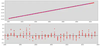
plt.figure(figsize=(15,7))
plt.plot(sealv_sf['Year'], sealv_sf['Linear_Trend'],
           label = "NOAA Linear Trend",
           color='red')
plt.plot(linear_data['Year'], y_values,
           label = "My Linear Trend", color='blue',
        linewidth=1)
plt.xlim(1990,2025)
plt.ylim(-0.1,0.1)
plt.ylabel('Meters')
plt.xlabel('Year')
plt.title('Relative Sea Level trend - San Francisco, CA')
plt.legend()
plt.show()
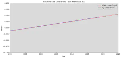
Notice the jagged NOAA Linear Trend plotted against our linear model. Also, notice that there is a very small change (in meters) in San Francisco sea level to 2025, this is because it is a regional sea level which differs from global sea level. There are global and local sea levels, the first one is more depedant on Antartica and Greenland icesheet melting, the second depends on the local land rise and sink levels as well as regional tides.
from IPython.display import HTML
HTML('<iframe width="560" height="315" src="https://www.youtube.com/embed/gq5DmiRfmG0" frameborder="0" allow="accelerometer; autoplay; encrypted-media; gyroscope; picture-in-picture" allowfullscreen></iframe>')
With these facts in mind, let’s calculate the residuals for our linear model.
residual = linear_data['Monthly_MSL']-y_values
residual
612     0.055790
613     0.065790
614     0.008790
615    -0.063210
616    -0.003210
          ...
2033    0.058335
2034    0.005335
2035    0.006335
2036    0.023335
2037   -0.018665
Name: Monthly_MSL, Length: 1424, dtype: float64
plt.figure(figsize=(15,7))
plt.subplot(2,1,1)
plt.scatter(sealv_sf['Year'],sealv_sf['Linear_Trend'],
            color='red',label='NOAA Trend Line')
plt.plot(linear_data['Year'],y_values,
         color='blue',label='Our Linear Trend Line')
plt.subplot(2,1,2)
plt.scatter(linear_data['Year'],residual,color='red')
plt.hlines(0,xmin=1990,xmax=2020)
plt.xlim(1990, 2020)
plt.tight_layout()
plt.show()
rms = sqrt(mean_squared_error(linear_data['Monthly_MSL'], y_values))
print("The root means square errors for this linear model is:", rms)
The root means square errors for this linear model is: 0.05687617830371646
We observe a pattern in the residual that is fairly consistent and have a small rmse. We can continue to compute the rmse till it gets to a satisfactory number that gives us the line of best fit. Here, we will bootstrap the slopes to find out the range of best fit slopes. We wil do so by splitting the data in two periods, 1900-1940 and 1979-2019
#subsetting two periods for bootstrap
ealier_period = linear_data[(linear_data['Year'] <= 1940) & (linear_data['Year'] >= 1900)]
later_period = linear_data[(linear_data['Year'] <= 2019) & (linear_data['Year'] >= 1979)]
slopes = []

for i in np.arange(10000):
    boot_table = ealier_period.sample(300, replace=True)
    slope = np.polyfit(boot_table['Year'], boot_table['Monthly_MSL'], 1)[0]
    slopes.append(slope)
slopes_2nd = []

for i in np.arange(10000):
    boot_table = later_period.sample(300, replace=True)
    slope = np.polyfit(boot_table['Year'], boot_table['Monthly_MSL'], 1)[0]
    slopes_2nd.append(slope)
#creating percentiles for each bootstrap

left_1 = np.percentile(slopes, 2.5)
right = np.percentile(slopes, 97.5)
left_2 = np.percentile(slopes_2nd, 2.5)
right_2 = np.percentile(slopes_2nd, 97.5)
plt.figure(1,(15,5))
plt.hist(slopes, ec = "black", alpha =0.5, label= 'bootstrap slopes: 1940 - 1940')
plt.hist(slopes_2nd, ec = "black", alpha = 0.5, label = 'bootstrap slopes: 1979 - 2019')
plt.legend(loc='upper left', fontsize = "medium")
plt.xlabel("Slope meters/year")
plt.ylabel("Frequency")
plt.axvline(x=left_1,linestyle='--',color='red',label='95% confidence interval on bootstrap 1')
plt.axvline(x=right,linestyle='--',color='red')
plt.axvline(x=left_2,linestyle='--',color='blue',label='95% confidence interval on bootstrap 2')
plt.axvline(x=right_2,linestyle='--',color='blue')
plt.show()
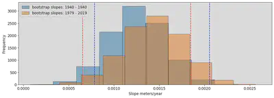
We can see here that the true slope that falls within both confidence interval ranges is somewhere around 0.0008 - 0.0018 meters/year or 0.6 - 1.8 mm/year, this is a bit lower than our 1.96 mm/year estimate. However, these slopes come from two small subsets of the data, it is normally expected to cover less sample data and therefore the result could be lower than the overall slope.
Bootstrapping the slope for confidence interval
Data about Elevation from NOAA
We are going to assume the regions most affected by sea level rise are low-lying areas, areas with low elevations. This will help us look at where the vulnerable areas are.
This a five-foot interval elevation contour data for San Francisco from DataSF derived from a Digital Elevation Model (DEM). The DEM itself is too large for jupyter to handle so we will be using its product instead.
sf_elv = gpd.read_file("data/geo_export_8d83d8c4-2cd5-40f8-bfb9-f1b2cc9660c1.shp")
sf_elv.head()
| elevation | isoline_ty | objectid | shape_len | geometry | |
|---|---|---|---|---|---|
| 0 | -25.0 | 800 - Normal | 1.0 | 2405.184767 | LINESTRING (-122.36531 37.72558, -122.36531 37... |
| 1 | 0.0 | 800 - Normal | 2.0 | 1590.082084 | LINESTRING (-122.40341 37.70055, -122.40341 37... |
| 2 | 0.0 | 800 - Normal | 3.0 | 2065.407961 | LINESTRING (-122.39484 37.70412, -122.39487 37... |
| 3 | 290.0 | 830 - Intermediate Depression | 4660.0 | 51.336442 | LINESTRING (-122.45631 37.71236, -122.45630 37... |
| 4 | 0.0 | 800 - Normal | 4.0 | 1075.020631 | LINESTRING (-122.40476 37.74909, -122.40478 37... |
Let’s look at how many contour lines we have, as well as the summary statistics for the elevation.
print("There are",len(sf_elv.elevation), "contour lines total for San Francisco.")
sf_elv.elevation.describe()
There are 14151 contour lines total for San Francisco.


count    14151.000000
mean       230.884743
std        194.011825
min        -40.000000
25%         75.000000
50%        190.000000
75%        330.000000
max        915.000000
Name: elevation, dtype: float64
Based on NOAA slope of 1.96 mm/year and our highest slope of 1.8 mm/year, we will look at region of 6 - 6.5ft elevation contour that might be under the water should sea level has these slopes.
at_risk_area = sf_elv[sf_elv["elevation"] <= 6.5]
at_risk_area.tail()
| elevation | isoline_ty | objectid | shape_len | geometry | |
|---|---|---|---|---|---|
| 6793 | 5.0 | 820 - Intermediate Normal | 6782.0 | 3805.962590 | LINESTRING (-122.50109 37.72220, -122.50112 37... |
| 6794 | 5.0 | 820 - Intermediate Normal | 6784.0 | 2364.108188 | LINESTRING (-122.37693 37.71646, -122.37695 37... |
| 6795 | 5.0 | 820 - Intermediate Normal | 6785.0 | 4111.572743 | LINESTRING (-122.38303 37.71994, -122.38305 37... |
| 6796 | 5.0 | 820 - Intermediate Normal | 6786.0 | 2106.095187 | LINESTRING (-122.38079 37.71386, -122.38079 37... |
| 6797 | 5.0 | 820 - Intermediate Normal | 6787.0 | 2083.944389 | LINESTRING (-122.37961 37.71362, -122.37962 37... |
at_risk_area2 = sf_elv[sf_elv["elevation"] <= 10]
at_risk_area2.tail()
| elevation | isoline_ty | objectid | shape_len | geometry | |
|---|---|---|---|---|---|
| 6898 | 10.0 | 820 - Intermediate Normal | 6888.0 | 3300.491628 | LINESTRING (-122.50673 37.73274, -122.50673 37... |
| 6899 | 10.0 | 820 - Intermediate Normal | 6889.0 | 2782.630223 | LINESTRING (-122.50160 37.73386, -122.50163 37... |
| 6901 | 10.0 | 820 - Intermediate Normal | 6890.0 | 4406.412788 | LINESTRING (-122.37637 37.74419, -122.37634 37... |
| 6902 | 10.0 | 820 - Intermediate Normal | 6892.0 | 2943.296370 | LINESTRING (-122.37746 37.71486, -122.37744 37... |
| 6903 | 10.0 | 820 - Intermediate Normal | 6893.0 | 1632.034490 | LINESTRING (-122.38019 37.71475, -122.38017 37... |
at_risk_areaProj2 = at_risk_area2.to_crs({'init': 'epsg:3857'})
#Lets get bounding box for our maps - minx, miny, maxx, maxy
at_risk_area.geometry.total_bounds
array([-122.51774193, 37.70039995, -122.35697917, 37.83324921])
import contextily as ctx
fig, (ax1, ax2) = plt.subplots(nrows = 1, ncols=2,figsize=(15,10))
fig.suptitle("Areas At Risk with Current 1.96 mm/yr and 2100 3m/year Sea Level Rise")
at_risk_areaProj.plot(column = 'elevation', ax = ax1, legend =True,
                     legend_kwds={'label': 'Elevation',
                                 'orientation': 'horizontal'})

at_risk_areaProj2.plot(column = 'elevation', ax = ax2, legend =True,
                     legend_kwds={'label': 'Elevation',
                                 'orientation': 'horizontal'})
ax1.set_axis_off()
ax2.set_axis_off()
ctx.add_basemap(ax1, url=ctx.providers.Stamen.TonerLite)
ctx.add_basemap(ax2, url=ctx.providers.Stamen.TonerLite)
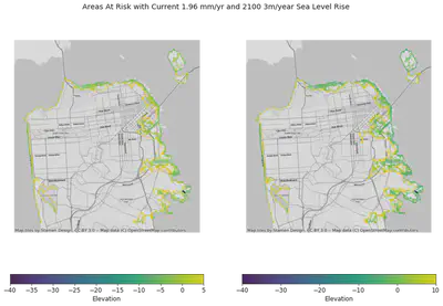
We can see that most areas such as treasure island and most of East and West coastlines of SF wil be affected by the current sea level slope. Global sea level rise yield a different outcome. NOAA suggested as high as a 3 meters rise by 2100, the picture on the right shows an equivalent of 10ft elevation contour that will be submerged by 2100. We can see that the West of SF has lower elevation than the East which will makes it more susceptible to both local and global sea level rises.
Conclusion:
In this assignment, we have look at sea level rise data from NOAA in San Francisco to understand whether it is actually increasing. From our lowess analysis, our slope is 1.93 mm/year and our linear regression analysis yields a 1.96 mm/year which is the same slope that NOAA has suggested. We also observed a consistent pattern in the residual suggesting that the linear regression model may not fit the data perfectly, the root means square error is 0.056. We visualized these slopes against the raw data, the lowess line sits right below to NOAA trend line and our linear model trend line sits at on top of the jagged trend line at a closer observation.
To further understand the slope, we then bootstrapped our slopes in two different periods, 1900-1940 and 1979-2019 to find our true slope, between the two 95% confidence interval, our result shows a slope from 0.6-1.8 mm/year. From these results, we can confirm that yes, San Francisco sea level is rising regionally, global sea level is not accounted in our analysis.
Lastly, we looked at the regions at risk of being submerged under water should the slope continues to advance to 3m/year as projected by the NOAA. The most concerning area is to the East coast of San Francisco. The future of Treasure Island also looks dimmed it is at a much lower elevation.
Work Cited:
Sea level data: https://tidesandcurrents.noaa.gov/sltrends/sltrends_station.shtml?id=9414290&plot=intannvarsince
Elevation contour data: https://www.ncei.noaa.gov/metadata/geoportal/rest/metadata/item/gov.noaa.ngdc.mgg.dem:741/html